Adobe Illustrator Tutorial for Beginners | Master 3D Text and Typography Design
Adobe Illustrator Tutorial for Beginners | Master 3D Text and Typography Design

To Watch Video
Click Here
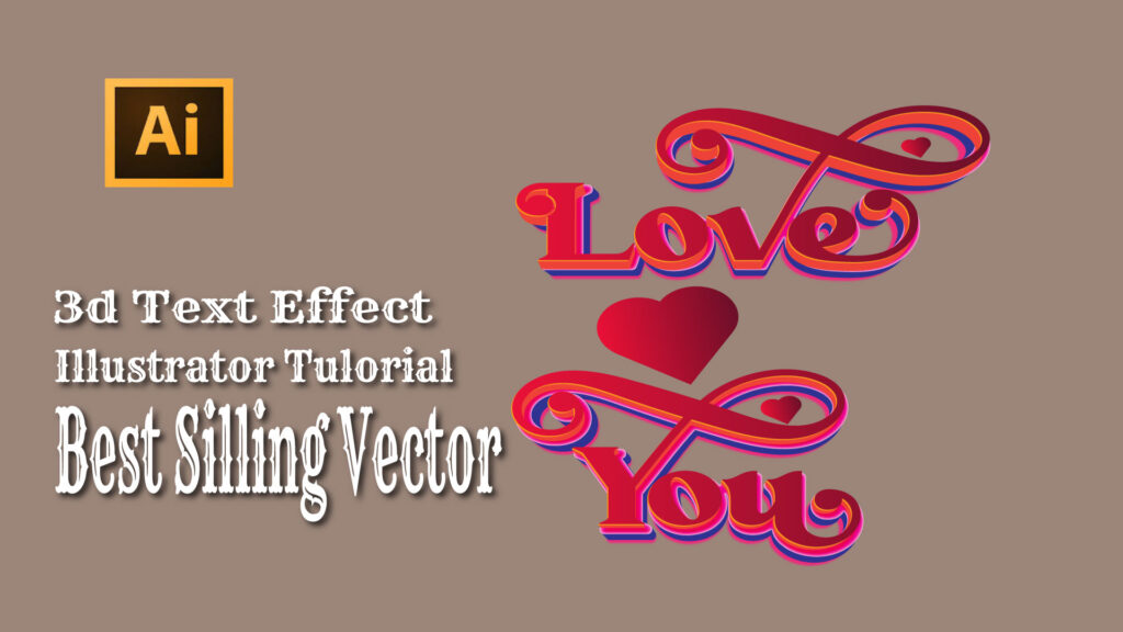
Typography plays a crucial role in graphic design — it’s not just about writing words but communicating emotion, energy, and personality through letterforms. One of the most exciting ways to make typography stand out is by transforming flat text into realistic 3D artwork. In this detailed Adobe Illustrator tutorial, you’ll learn how to create stunning 3D text effects using Illustrator’s 3D and Materials tools, even if you’re a complete beginner.
Whether you’re designing a logo, a poster, or a digital artwork, mastering 3D text will help your designs look more dynamic, polished, and professional. Let’s dive into this step-by-step guide to creating and styling 3D typography in Adobe Illustrator 2025.
1. Why Learn 3D Text Design in Illustrator?
Adobe Illustrator is one of the most powerful tools for creating vector-based artwork. The new 3D and Materials panel allows you to easily extrude text, apply lighting and shadows, and experiment with different materials to achieve realistic effects.
Learning 3D text design helps you:
- Enhance your typography and logo design skills.
- Create professional visuals for branding, advertising, and digital art.
- Build portfolio-ready designs that impress clients or help sell your work on stock platforms like Adobe Stock and Creative Market.
Even if you’ve never used Illustrator before, this tutorial will walk you through each step so you can confidently create your first 3D text effect.
2. Getting Started – Setting Up Your Workspace
Before you start designing, open Adobe Illustrator 2025 and set up your document.
- Go to File > New and select your desired canvas size (e.g., 1920×1080 px for digital or A4 for print).
- Choose RGB color mode for digital projects or CMYK if you’re planning to print your design.
- Type your text using the Type Tool (T). Choose a bold, clean font — something like Montserrat Bold or Bebas Neue works great for 3D effects.
Once your text is ready, convert it to a vector shape by selecting Type > Create Outlines. This step ensures that your text remains scalable and editable when applying 3D effects.
3. Applying the 3D Effect
Now the real magic begins.
- With your text selected, go to the top menu and choose Effect > 3D and Materials > Extrude & Bevel.
- A panel will open with different customization options. Adjust the Depth to create a realistic extrusion — around 50–100 pt works well for most designs.
- Experiment with Bevel shapes and Lighting settings to add shadows and highlights.
- Use the Rotation controls to set your desired perspective — a slight tilt adds depth and makes your text stand out.
You’ll immediately notice how your flat typography transforms into a dimensional masterpiece. Illustrator’s real-time rendering feature makes it easy to preview changes as you go.
4. Enhancing Your 3D Typography with Materials and Lighting
To make your 3D text look even more realistic, explore Illustrator’s Materials and Lighting options:
- Metallic Finish: Choose a shiny material and adjust the Roughness and Metallic sliders to simulate gold, chrome, or bronze surfaces.
- Matte Finish: Reduce metallic shine for a more subtle, professional look.
- Lighting Adjustments: Move the light source angle to highlight key areas of your design. You can also add ambient light for softer illumination.
A balanced combination of shadows and highlights gives your 3D text that professional, studio-quality finish seen in commercial designs and product logos.
5. Adding Color, Gradients, and Shadows
Once your 3D form looks perfect, it’s time to style it:
- Use the Gradient Tool (G) to blend multiple colors smoothly across your text surface.
- Apply Drop Shadows under Effect > Stylize > Drop Shadow to ground your text and enhance depth.
- Try Blending Modes (like Overlay or Multiply) for more creative lighting effects.
For example, a gold gradient paired with soft shadows creates a luxurious feel, while metallic blues and silvers look futuristic and tech-inspired.
6. Final Touches – Composition and Exporting
Now that your 3D text is complete, it’s time to prepare it for use in your projects.
- Add a background gradient, pattern, or simple texture to make your text pop.
- Group all your layers and name them properly for easy editing later.
- When you’re ready to export, go to File > Export > Export As and select your preferred format (e.g., PNG for web, PDF or EPS for print).
Make sure to enable Use Artboards if you want to export the design without extra space around your artwork.
7. Practical Uses for 3D Text Design
3D typography can enhance almost any kind of project. Some great ways to use your new skills include:
- Logo Design: Create bold, memorable brand identities.
- Social Media Graphics: Add dimension to titles and announcements.
- Poster and Flyer Design: Make headlines stand out.
- YouTube Thumbnails: Capture attention instantly with eye-catching 3D text.
- Stock Marketplaces: Sell your 3D vector designs on Adobe Stock or other platforms.
The more you practice, the easier it becomes to develop your own 3D design style that matches your creative brand.
8. Common Mistakes to Avoid
Beginners often make a few small errors when working with 3D text. Here’s how to avoid them:
- Don’t overdo the lighting — subtle highlights look more professional.
- Avoid too many materials; keep your design clean and cohesive.
- Always convert text to outlines before applying effects to avoid distortion.
- Save your progress frequently — Illustrator’s rendering can be intensive on some systems.
Following these tips ensures your designs stay clean, realistic, and visually balanced.
9. Conclusion – Keep Practicing and Exploring
Learning how to create 3D text in Adobe Illustrator is one of the most rewarding design skills you can develop. It opens new creative possibilities, helps you stand out as a designer, and allows you to craft visuals that truly capture attention.
With practice, you’ll start to master lighting, texture, and perspective — the key ingredients for professional 3D typography. Whether you’re designing for clients, content creation, or your portfolio, this technique will elevate your visual storytelling.
Follow & Connect
For more step-by-step design tutorials, creative tips, and Illustrator techniques, follow me on social media:
Facebook: https://www.facebook.com/creativeakzada/
Instagram: https://www.instagram.com/creativeakzada/


In case you’re keen to learn about your color season, finding out whether you correspond to the deep summer palette can significantly help enhance your wardrobe and makeup choices. Deep summer color analysis emphasizes subtle, cool tones that enhance yellow undertone skin and olive complexions, making it smoother to determine clothing colors that bring out your natural beauty. For a free interactive experience, you should consider to try an AI color analysis quiz online—there are some amazing tools that supply insights without any cost [url=https://color-analysis-online.org]colors by season[/url] .
Understanding your season goes beyond just clothes; hair color trends for 2026 also link with seasonal color theory, so you can research options like cool summer hair color or shades that perform excellently for pale or yellow undertone skin. If you’re questioning “what season am I?” or in need of a skin tone chart to direct your choices, seasonal color palettes and color analysis apps can make the process entertaining and reliable. Discovering these resources really helps in figuring out what colors make you become brilliant!